What would Melissa Breault do? – a pastel process –
You have chosen your subject, all your favorite pastels are out and you can’t wait to get started on your new pastel painting! Many rush into it without asking themselves too many questions. After all, we often paint to give ourselves a moment of peace, to stop thinking and to escape the worries of everyday life. Except, My process involves A LOT of thinking and decision making. It can seem pretty tedious from the perspective of the fast doer, but this longer, meticulous and well structured approach gives me the satisfying feeling of knowing what I am doing and why I am doing it that way. It also comes with the reassuring feeling of knowing that I will be able to avoid a ton of mistakes from the get go, and that I’ll breeze through the process, overcoming any obstacle that will come along the way. Something important to understand is that there will always be challenging parts in a painting, no matter what level you’re at, so better be equiped to surmount them! The goal of having a method, a stuctured approach to our art, and a lot of information to rely on, is that it frees us from uncertainties and gives us answers to questions we might have thought were supposed to be answered only by our artist intuition. There is so much more to it! Here is a glimpse of my process.
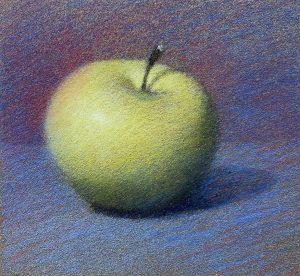
1- Choosing the paper
Over the years, I have experimented with all kinds of pastel papers. My go-to has been the Pastel Card paper by Sennelier. So when it comes to choosing, I really only have to choose one of the colours that this particular brand offers. I choose mostly based on the tone of the paper, before even considering the colour. For this particular subject, the green apple on a blue background, I chose a neutral medium gray that ressembles the tone of my background. When the tone of the paper is close to the tone of the overall background, it makes it easier to make the subject stand out early in the process. (More on the subject in Step 3 and 4)
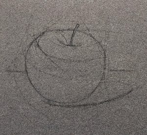
2- The drawing
I find it very important to start with an accurate drawing. When I say accurate, I am talking about having the whole composition of the painting layed out with the right positioning and proportions, including the outline of the projected shadows. This is a good way to know if my composition is well balanced (if I haven’t made preliminary composition studies before commiting my design onto the paper).
Starting with a light sketch helps me make all the necessary corrections without marking my paper with heavy construction lines that I wouldn’t be able to erase easily or cover with the pigments. This is especially important if you’re planning to have some parts of your paper show as part of the final result.
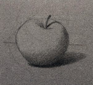
3- The darker tones
First, I make sure to create the volume before approaching colours. Squinting at the subject or at the photo document I am using helps me simplif and understand what I am seeing by removing all the distracting, unecessary details.
Squinting also helps me group all the tones into three simple categories: dark, medium and light.
In this particular situation, my background acts as my medium tone. By squinting at the subject, I am able to locate all the tones that appear to be darker than my background. I then sketch them on my medium tone paper using a 6B General’s charcoal pencil. Using a black pastel pencil would be too much of a commitment, as it would tend to stain the colours, making them look dirty and lifeless. Charcoal is softer and less staining. As I apply the charcoal to create the dark tones, I make sure to keep the edges of the masses soft rather than sharp. It will give my subject a better effect of volume and will make everything look more realistic.
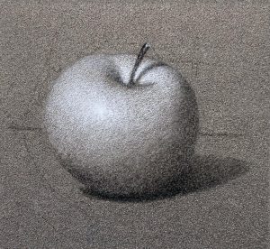
4- The lighter tones
When the dark tones are placed, I then use a General’s white pencil to create the lighter tones. I squint at my subject and locate the areas that are ligther than my medium tone background and I start applying some fine layers on my paper. I do this until I get the right contrast with the background. I stop when I see that my light tones are light enough, without being too contrasting. How do I know this? By squinting some more! I squint at my subject and then I squint at my drawing. If they are the same then I did a good job! If not, then I adjust until the contrast is true to what I am seeing. Better get used to it! There is just a whole lot of squinting in this process. (And in my life in general!)
When working on the light tones, I like to start around the area where the light hits the most and work my way away from there. For this apple, I start with locating the highlight (the little dot of pure light) and I create a soft gradient from lightest at the highlight, to slighlty less light moving away from that point toward the edges.
The area between the light and the shadow is left as is, showing the paper and acting as my medium tone, helping me create a smooth and natural gradient from light to dark.
My grisaille is now completed and I can move on to colours.
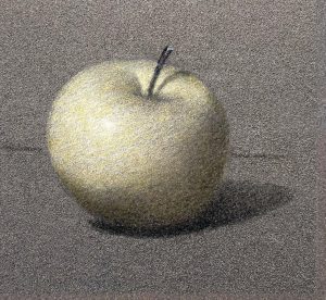 5- First colour glaze
First of all, I need to specify that when I use the word glaze in the context of a pastel painting, I mean it in the sense of the application of a layer of transparent or semitransparent colour, as would the watercolourist do with his pigments diluted in water. The oil painter also can mix his pigments with a resin medium to be able to apply the paint as very thin transparent layers of colours on an underpainting. It affects the original colours beautifully, allowing for a transluscency otherwise very hard to obtain with strokes of opaque paint.
In the context of a work in pastel, water or liquid medium is not used. Instead, the transparency here is achieved by applying layers of pigments so thin that we can still see what’s underneath.
I love starting a pastel with glazes for many reasons. One of them is to preserve the grisaille I worked on in the previous steps. So, instead of covering the black and white apple with opaque strokes of pastel sticks to colour it, I gently mix the pigment with the tones underneath. In the case of this apple, I start with a yellow pencil and apply a layer on the entire apple. Yellow naturally being a very light colour, I can apply a little bit more pigments on the ligther areas without fear of darkening the light tone.
The yellow colour appears vibrant in the light because it’s been layered on top of the white pencil. In the shadow, where we want the tones to stay darker, the yellow only gives it a little tint without affecting the darkness of the tone.
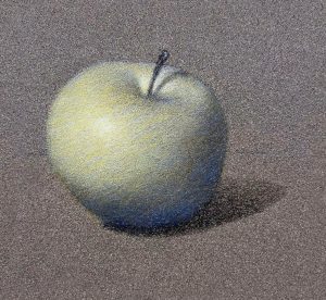
6- Colour glaze on the shadow of the apple
On my newly yellowed apple, I add a layer of blue to make it look more green. (Yes, even with all the crazy stuff happening in the world these days, yellow and blue still make green – I find it very reassuring!) Blue is naturally a darker colour, so I make sure not to press too much on my pencil when applying it on the ligther areas. I sometimes opt for a ligther shade of blue for the lighter areas if I want to add a little more without darkening. On the contrary, I press a bit more with my pencil on the darker parts such as the shadow on the apple, giving the darker tone a bluer feel and a much more vibrant look than its original plain charcoal layer.
7- More layering of glazes on the apple
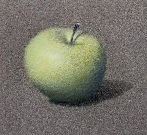 I continue to layer with the yellow and blue pencil on the apple. If my green gets too vibrant in the shadow, I add a layer of dark red to neutralize it and make it look more gray. I tend to work with limited colour palettes, especially when starting a painting with the pencils. I use a red, a blue, a yellow, the General’s white and the General’s 6B pencil.
Using a limited palette to start my pastel painting helps me with a few important things :
- By using only the three primary colours to mix all my other colours, I am certain that all the colours created will be harmonious with each other.
- By mixing a green from scratch directly on the paper with yellow and blue, I obtain a more vibrant colour. As the two colours are not completely blended together when applied, both colours can be individually perceived, resulting in a richer and more interesting colour than the premixed green pencil.
- A very practical aspect of having only 3 colours to work with is that you only have 3 colours to choose from while working. When I start a painting, one of my first objective is to be able to have, as early as possible, a clear idea of what the whole thing is going to look like. Having only 3 colours allows me to simplify and speed up the process in addition of having a pleasant colour harmony on the whole thing before I commit to thicker and creamier pastel strokes, later on.
- At this early stage of the work, I want to stay away from distracting and overpowering vibrant colours. Lightly blending the colours together with a limited palette helps me keep my colours interesting and rich, without becoming too saturated.
8- Colours on the background
The same process goes for the background. I layer the red on top of the blue pastel pencil to create a blueish purple. At this stage, I make sure to vary the tones of the background to create the illusion of space. A darker tone in the background pushes it back and a lighter tone on the table in the foreground will make that area appear closer to us. I make sure to keep most of my edges soft. Especially the ones at the back. The fold of the fabric that creates the horizontal «line» is a good example of that.
There are a few very useful tips I would like to mention here that you can use when it comes to creating a sense of space in a painting.
If you’d like a part of your painting to appear further away, at the back, or if you want an element to attract less attraction, be less noticeable such as something outside of your center of focus, you want this area or this element to have:
- softer edges
- lower contrasts
- less saturation
- fewer details
- thinner coats of pastel
- smaller strokes
- less texture
Following the same logic, to bring something closer, to attract the attention and bring the focus to an element, you want to have:
- sharper edges
- stronger contrasts
- more saturation
- more details
- thicker coats of pastel
- larger strokes
- more textures
I start paying attention to these ‘rules’ right from the start, in the sense that I keep them in mind at all times. At this stage of the painting, not all of them can be used as we haven’t introduced any textures or details yet, but just keeping in check your edges, your contrasts and your saturation will help you tons in the rendering of the third dimension.
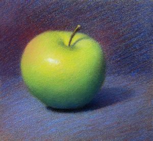
9- The use of the pastel sticks on the apple
This is when I start adding more thickness and more vibrant colours. I start with the subject, my focal point, whatever it is I want to attract the attention to. As a general rule, I apply thicker strokes where the light hits the most, in the foreground, and in the parts of the object that is the closest to me to enhance the volume. Same applies for more vibrant colours. The areas I often like to leave with a thinner layer of pastel are the shadows and the parts that are further away from my focal point.
10- The use of pastel sticks on the background
Now, I am back to the background. I continue making decisions in regard to the tones, the colours and all the gradients surrounding the apple. My decisions are guided by this question: what can I do to make my subject more interesting? I decide to darken the back even more to make my apple stand out even more. I also decide to get the blue of the fabric closer to what I see in real life. After all, I chose that intense ultramarine blue because I loved the depth of it! I choose a dark blue and a dark red to create that light effect bouncing on the side of the apple. For the foreground – the horizontal surface on which the apple is resting – I don’t hesitate to cover the paper with thick strokes of a lighter blue to give it more presence.

11- Details textures and subtilities
Details usually call for smaller strokes, so it would be somewhat counterintuitive to use big creamy sticks of pastel, wouldn’t it? Except, they are the ones that will stick best on top of all the other layers and are also the ones offering the most vibrant colours. Small details can absolutely be done with a chunk of pastel and here is how: you just have to intentionally drop your cherished stick on the hardwood floor of your studio to obtain a bunch of smaller pieces adorned with sharp edges and points, perfect for detail work! Maybe not for the faint of heart, but it really works!
I use them to enhance the colours in the most vibrant areas, usually where the light is (as opposed to in the shadows). I apply thick tiny strokes to create the textures around my highlight and I make sure not to go too close to the borders of the apple. I vary my colours. I interlace a warmer green and a slighly cooler one to make things more interesting. With a semi-hard stick, I add a bit of red on the top and left side of my apple to darken that edge and make it look further than the front in the light. I add a hint of red in the shadow on the apple to harmonize with the rest and to neutralize the green a bit more.
I get up, step back, observe… it works!
A pastel painting can offer a rich range of textures and a wide variety of thicknesses. This is even more true if you have a varied collection of pastels. I use pastel pencils for the application of thinner layers, semi-hard pastel sticks to obtain more coverage and for blending smother areas, and finally, I use very soft and creamy pastel sticks for the thicker and more pronounced strokes. I usually work from thin to thick, but it happens that I first apply a thick layer of very soft pastel that I then scratch or scrape parts of with a stiff brush to create different textures. There are many tools the pastel artist can use other than the pastels themselves. Creativity and imaginative experimentation is, in itself, your best asset when combined with solid knowledge.
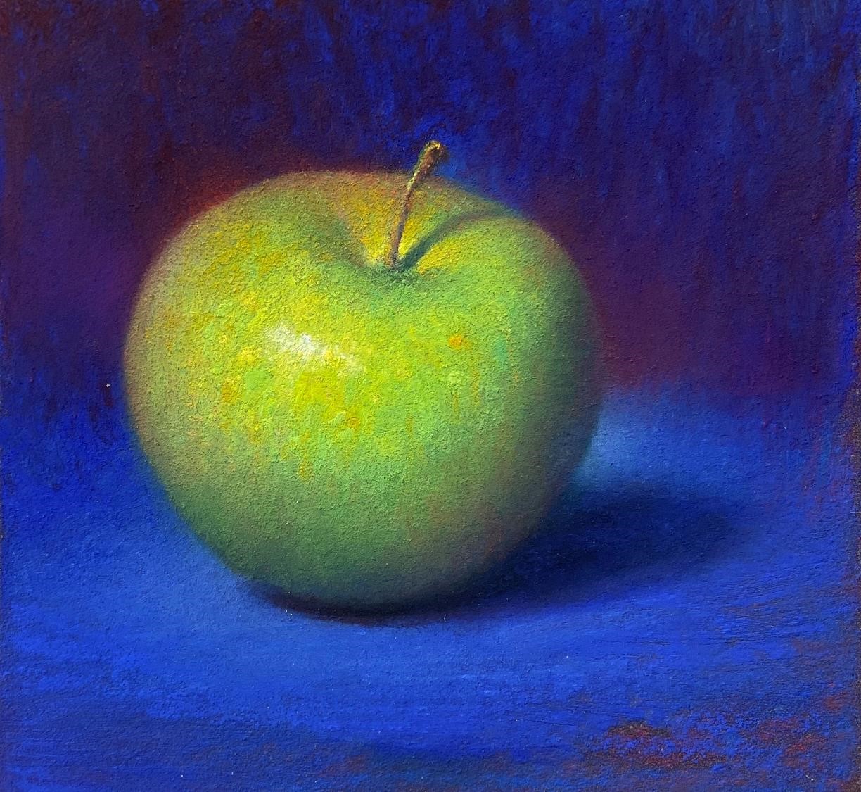
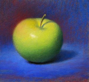
FINAL RESULT